Metrics are usually lying to you.
There isn’t anything nefarious going on; the metrics (…hopefully) aren’t just wrong, and your coworkers (…hopefully) aren’t secretly working for your competitor to undermine your team’s operational excellence.
A metric is just a perspective – an impossibly thin, one-dimensional slice of a system, and it’s up to us meatbags to try to infer its meaning. Too often, we get it wrong – we draw a slightly incorrect conclusion from a graph, and then start making some questionable decisions.
So, I wanted to share one tip, which has helped me make that mistake less often!
For this post, let’s use as an example a pretty common kind of metric – a duration (or latency). Maybe we’re tracking web request latency, or how long our cronjobs are taking to run.
I want to start by looking at the two most common kinds of aggregations for these metrics:
- A
count(how many requests-per-second are we processing?) - An
average(how long are these requests generally taking to process?)
Perhaps you are a smart patootie, you saw “average” and thought “ah, well there’s the first problem; we should be measuring percentiles here”!
Yes! But just hang on – for this argument, it makes no difference.
In particular, I want to talk about how, while they’re undoubtedly the most intuitive ways to present our metric… both can end up obfuscating important information.
Say we’re aggregating as an average. We’re responding to an incident, and in doing so we see the following graph:
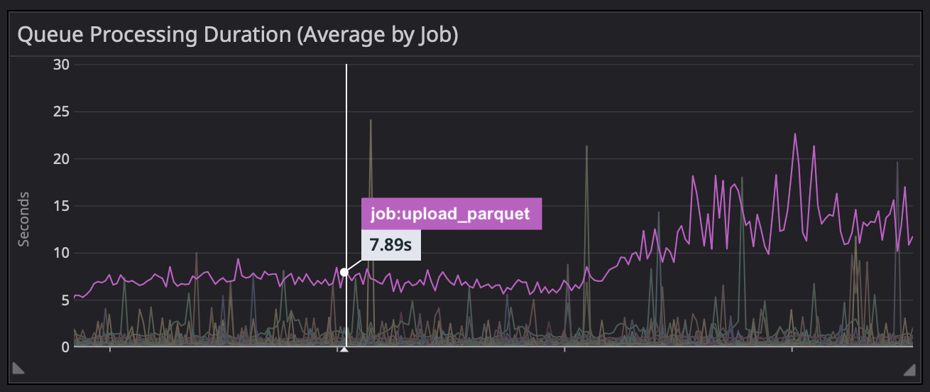
“Well there’s the problem,” we might think, “the time it takes to upload a parquet increased by 3x, and I bet that’s saturating all of our workers”!
Well… maybe. But then you poke around a bit more, and see that we’re only running a small handful of parquet jobs at any one time:
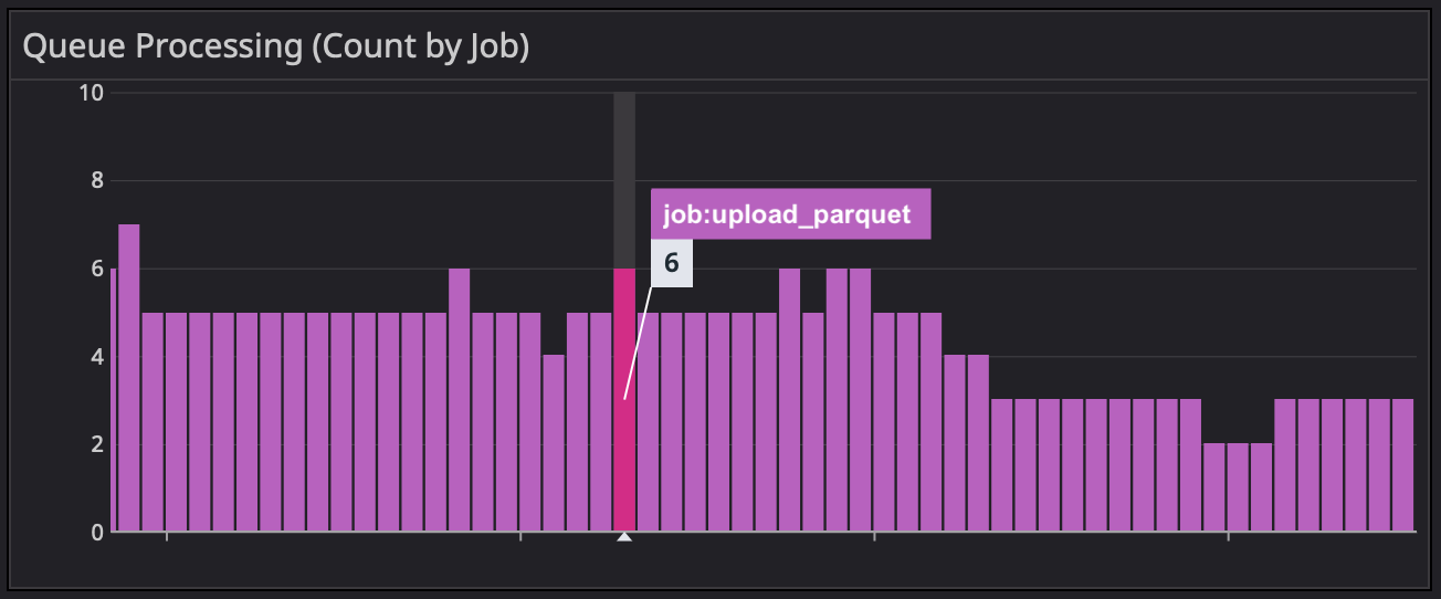
So – a red herring! There might be something going on there, but it probably wouldn’t cause our incident, even if these jobs started taking 10 times as long as usual.
Similarly, if we aggregate as a count, we expose ourselves to the opposite problem. Maybe we start work for the day, go to check on our high-level dashboard, and WAIT WHAT IS THAT:
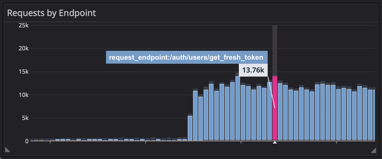
We might initially think “our servers can’t handle that many requests!” or “how has no one else noticed this yet?!”
But, no one’s noticed because it isn’t actually a problem: that big increase in requests is a harmless DDoS attack, and those requests are each getting blocked in less than a hundredth of a second.
Now, you might be thinking – “but Brandon, the key bit of information that’s ‘hidden’ in one graph, is shown clearly in the other – you can get the full picture you need just by looking at both aggregations, right”?
And – yes! That’s definitely true.
However, in my experience, there are a few subtle issues underneath this line of thinking:
- At least for me, it’s actually kinda hard to grok 2 graphs at the same time. Using data from one to correct a misleading implication from the other takes at least a little bit brainpower (sometimes in short supply)
- More critically, it means we should never show one of these in isolation. The missteps I’ve outlined above might seem trivial to correct, but we’re just humans, and it’s much harder to remember to challenge our assumptions if we don’t have the counter-argument staring us in the face. This, too, is a rule that’s hard to remember…
This brings us to the title of the post. In cases like this – consider a sum!
Aggregating a latency or duration metric with a sum is kind of non-intuitive. After all – if a count gives us “how many requests we got in a minute”, and an average gives us “how long did each of those requests take to process”, a sum instead gives us “what’s the total amount of time we spent processing requests in that minute”. Which seems… abstract, right? And not as immediately useful.
However, I’ve grown to like them in spite of that – because they never lie to you!
Check out this example – it’s sourced from the same data as “Requests by Endpoint” above, but it shows us something closer to what we actually care about: total system load (resources consumed by each endpoint), immune to both outlier latency and volume noise.
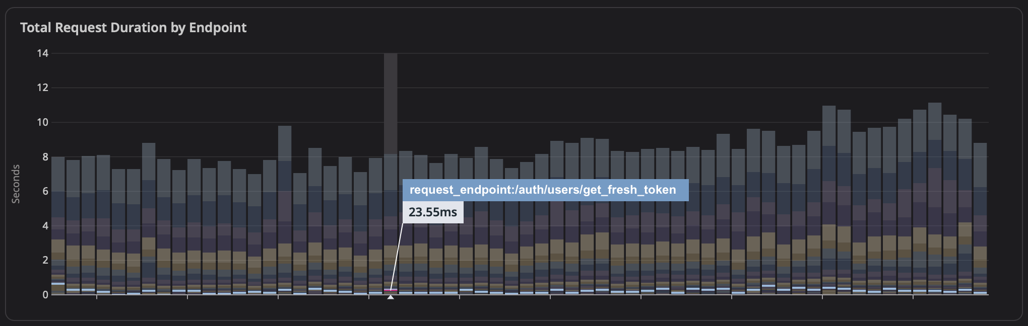
A chart showing “total amount of time we spent processing requests” won’t mislead you in the event of a bunch of super-short latencies or in the event of a small number of abnormally long ones, since in both cases, like above – they’ll barely register on the graph.
So, while a sum isn’t as representative of a request itself, no other aggregation consistently shows actual system impact like sum does. And I would argue that from the perspective of a system operator, there’s nothing better.